If you want to master Microsoft Excel, understanding charts is a must. In this post on www.bittutech.com, we explore all major Excel charts along with practical datasets to help you learn visually and effectively. From basic charts like Column, Bar, and Pie to advanced visuals like Scatter, Combo, and Pivot Charts — each chart is explained with real-world data examples.
Line Chart
Table of Contents
Line charts are most helpful in representing the trends. This can be very useful to analyze the ups and downs in a range of data over a particular time span. The data points in the chart are connected with the lines.
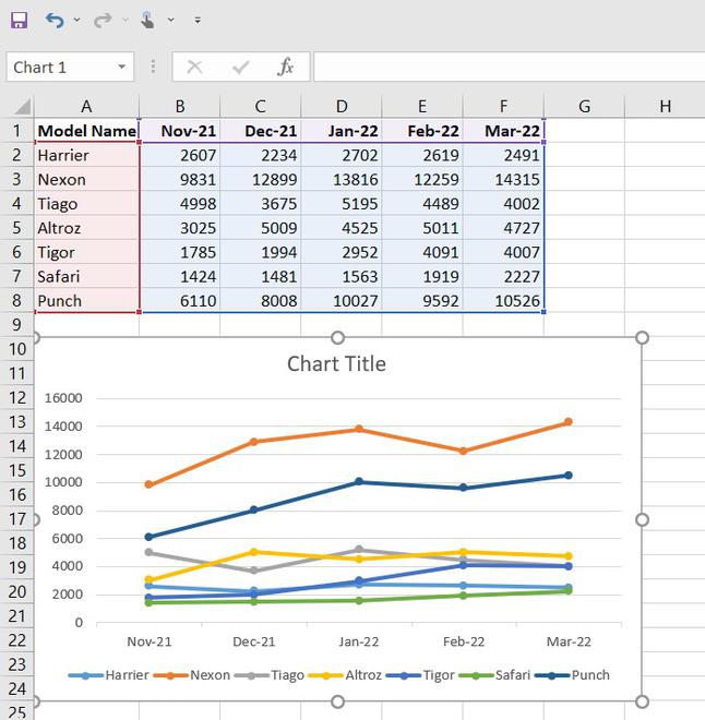
Note: To insert the graph, we need to select our dataset(or data table) and go to insert and then in the chart section and insert whatever graph we want.
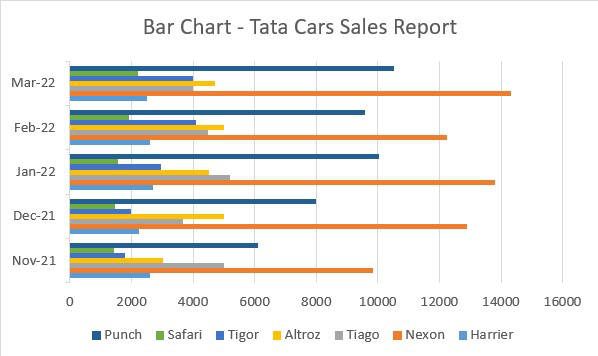
Bar Chart
Bar charts are used to represent the categorical data using the rectangular horizontal bars with their height and length proportional to the data values it is used to represent.
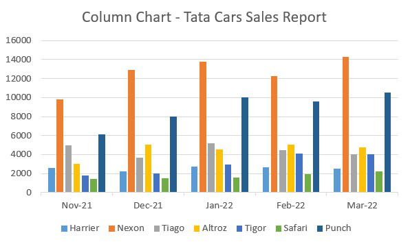
Column Chart
Column charts are used to represent the data in a vertical chart using the vertical bars. These graphs are mostly used for comparing the data points in the data. Column chart
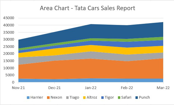
Area Chart
Area charts are used to display graphically quantitative data. It is similar to the line chart and based on it. The area between the lines is filled with color, and they are easy to analyze as they are similar to the line chart showing ups and downs in the data.
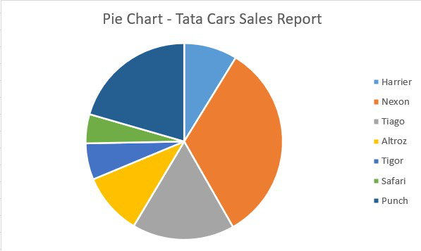
Pie Chart
Pie charts are circular statistical graphs that are divided into slices of pie in the proportion to data values to represent the data. They are commonly used to analyze the percentage allocation of data points incomplete dataset.
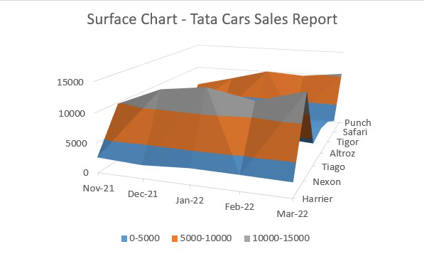
Surface Chart
Surface charts are 3-dimensional charts that are used to represent the data in a 3-dimensional landscape. They are mainly used to represent the large dataset. They display a variety of data at the same time.
Last Word:- As data continues to grow, the ability to visualize it effectively with Excel charts becomes not just a skill, but a necessity for anyone aiming to stay ahead.
